 |
clearString neatComponents
|
|
 | ||
 | How-to Resources |  |
Introduction to mobile design | ||
 |  |
While sites are generally inherently usable with any device without specific configuration, it is sensible to take care to improve the usability of sites on mobile devices, particularly if the sites are to be used on small or low resolution devices.

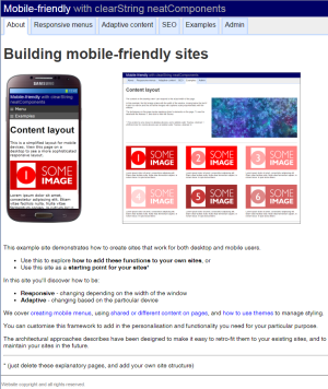
The techniques described in this section are demonstrated in this template site.
Click here to download the mobile-friendly example site
There are a number of approaches that can be used, either individually or in combination. The particular approaches you use will depend on the nature of your site and your audience.
If you are unsure what devices your users are viewing you site on, you can use Google Analytics to obtain a report showing the devices and resolutions.
Approaches
In this section we outline two main approaches:
Adaptive device-aware design
This works by detecting the device being used, via its User-Agent string, and then placing the user into a respective User Group. The site can then be configured to show different content based on the User Group.
Responsive width-aware design
This works by using CSS media queries, which are aware of the width of the browser window, and then using this knowledge to display or hide sections of pages.
Additional Resources |
| Mobile Sites |
Copyright © 2025 Enstar LLC All rights reserved |


